Portrait Typography:

-I decided to do a portrait of Niall Horan.
-I created separate layers for the portrait, and each piece of text.
-I put in text until it covered the entire picture.
-I changed the actual image to 'Screen'.
-I copied the first layer and changed the text so it would be different from the first.
-I used Wordle to create the really large text. (I just used the filter 'Threshold' to make the text black, and then I also used 'Screen' for the Wordle text.)
-I arranged and moved all the text until I liked how it looked.
Free Composition Typography:

-I pasted in lyrics from one of their songs for my type, and put the picture as the top layer, and I changed the mode to 'Screen'.
-I duplicated my text and changed the font and size of it to make it different from the first layer.
-I found an image of the One Direction logo, and added a drop shadow to it, to give it dimension.
-Then, I used Rainbow Gradient to give the image color.
-I duplicated my text and changed the font and size of it to make it different from the first layer.
-I found an image of the One Direction logo, and added a drop shadow to it, to give it dimension.
-Then, I used Rainbow Gradient to give the image color.
Abstract Composition Typography:
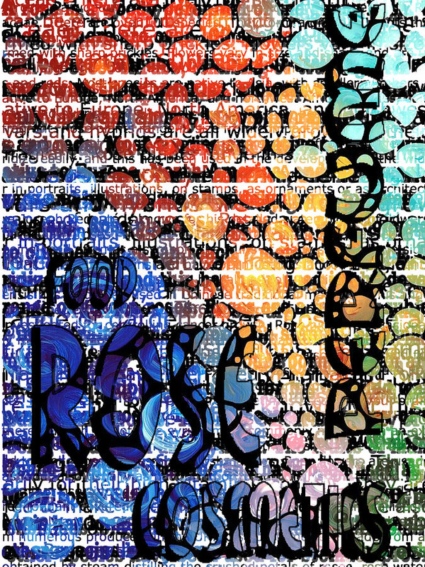
-I copied and pasted a bunch of text onto a separate layer.
-I copied that layer several times, and for each one, I made the text size and font different.
-I used Wordle to create the larger words in the image.
-The text was difficult to read, so I added a drop shadow, and an outline to it, to make it easier to read.
-I copied that layer several times, and for each one, I made the text size and font different.
-I used Wordle to create the larger words in the image.
-The text was difficult to read, so I added a drop shadow, and an outline to it, to make it easier to read.
